
Hoffmann Mineral - Redesign.
Hoffmann Mineral - Redesgin.
Client: Hoffmann Mineral
Agency: Serviceplan
Role: Art Director
Year: 2021
Client: Hoffmann Mineral
Agency: Serviceplan
Role: Art Director
Year: 2021
Client: Hoffmann Mineral
Agency: Serviceplan
Role: Art Director
Year: 2021
Client: Hoffmann Mineral
Agency: Serviceplan
Role: Art Director
Year: 2021
Client: Hoffmann Mineral
Agency: Serviceplan
Role: Art Director
Year: 2021
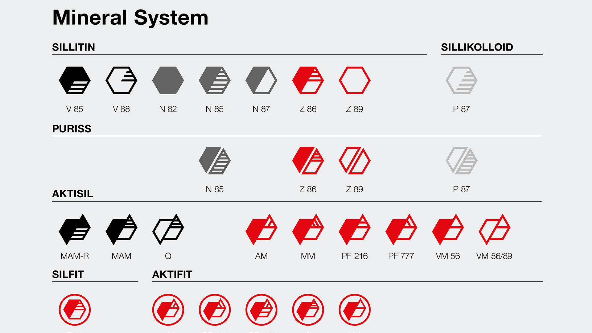
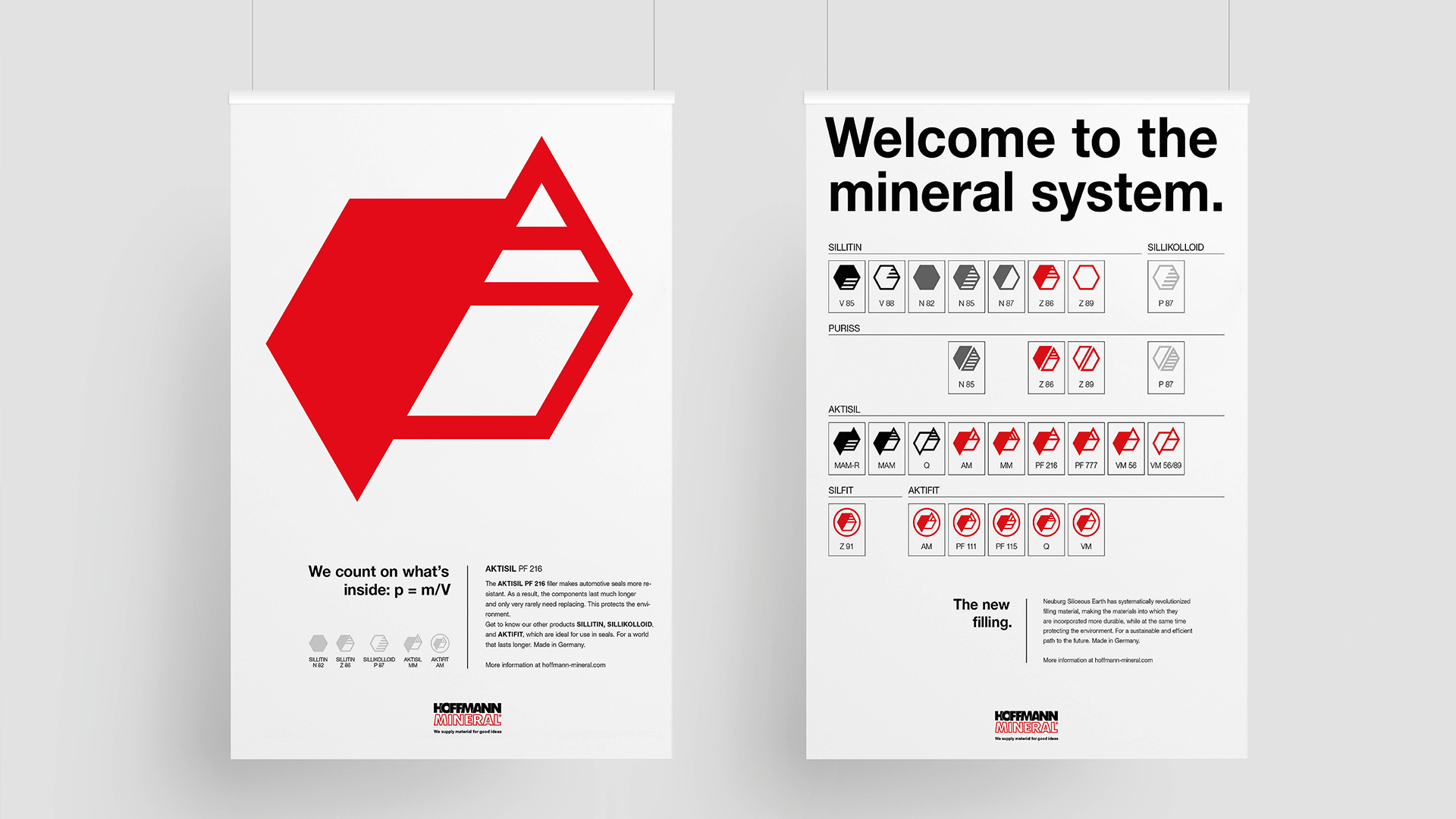
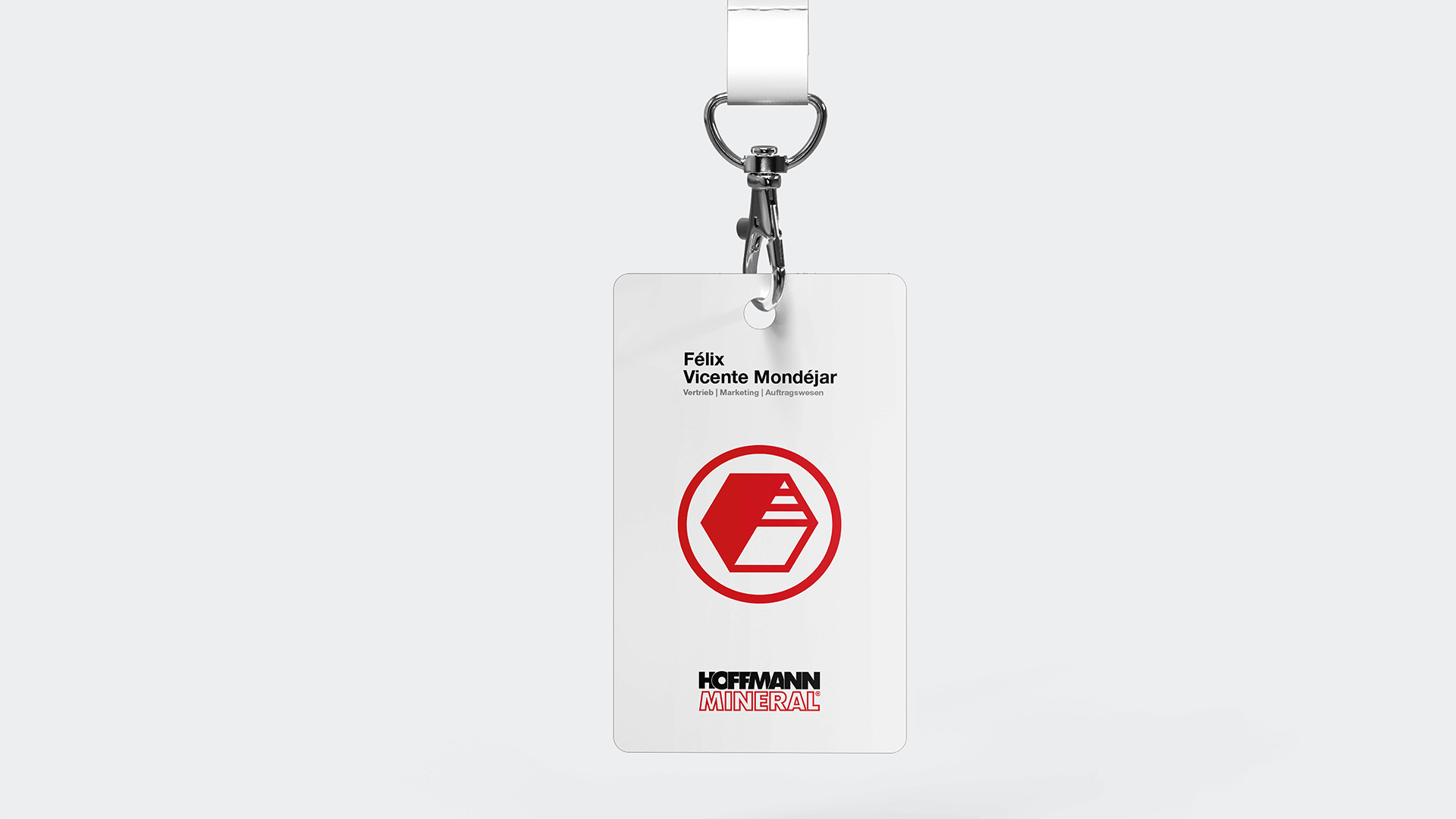
A brand, that wants to be understood all over the world, needs a universal language. And that's exactly what we created with our design: We translated the complex core product - the silica minerals - into globally understandable and flexibly applicable icons that can be found everywhere - whether in the packaging, in the trade fair stand or in our advertising materials.
Based on electron microscope images, we abstracted the minerals, graphically translated them into icons. From there on we developed a design that becomes visible as a "mineral system". In the spirit of atomic design, we have created a modular system that brings the icons into any graphic application. In print ads, posters, as an orientation and guidance system, as a trade fair stand, in packaging and in digital – and all of this understandable worldwide.
.
A brand, that wants to be understood all over the world, needs a universal language. And that's exactly what we created with our design: We translated the complex core product - the silica minerals - into globally understandable and flexibly applicable icons that can be found everywhere - whether in the packaging, in the trade fair stand or in our advertising materials.
Based on electron microscope images, we abstracted the minerals, graphically translated them into icons. From there on we developed a design that becomes visible as a "mineral system". In the spirit of atomic design, we have created a modular system that brings the icons into any graphic application. In print ads, posters, as an orientation and guidance system, as a trade fair stand, in packaging and in digital – and all of this understandable worldwide.


Awards: RED DOT / SILVER – Hoffmann Mineral // Corporate Design & Identity / Relaunch
Awards: RED DOT / SILVER – Hoffmann Mineral // Corporate Design & Identity / Relaunch
Selected Works
Hoffmann Mineral - RedesignCampaign

Kindernothilfe - Campaign 2021Campaign

Staybl AppFor Good


WEY – Website Layout ConceptWebsite


JOYN – Frau Jordan stellt gleichCampaign


BMW AFTERSALES - Brand RelaunchCampaign


Salomon Shoepon: Do Sports. Get Sports.Product Design // PR


BMW AFTERSALES – ServicesCampaign

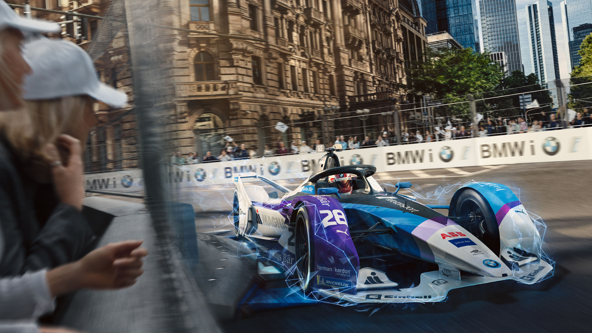
BMW MOTORSPORT - DTM BeautyshotsCampaign

DEUTSCHE LUFTHANSA – E-Dialouge.E-Dialouge


Tierpark HellabrunnPhoto

Wald und WiesePhoto

Calling SchnellPhoto

CroatiaPhoto
Copyright © 2025 Timo Cremer – All rights reserved.